Date Archives August 2022

How to Work with Big Brands as a Small Studio

Welcome to the Haus Report, your weekly dose of design, business, and leadership news, from BC Design Haus

In this issue, we’ll chat about how to work with big brands as a small studio, brand kit examples to inspire your design and marketing team, what you need to know to build a powerful brand in 2022, and challenges and lessons for new business leaders. Let’s dig into it! 

It can be a challenge to get the attention of big brands when you’re operating a small design studio. It doesn’t mean, however, that it can’t happen. There are often many factors at play when pitching your work to big brands, but at the core of it all, is—you guessed it—the work. If the work speaks for itself, if it’s dynamic and interesting, if it pushes the envelope, and makes people think or sparks a conversation, if it stands out from the crowd, chances are you’ve got a shot. 

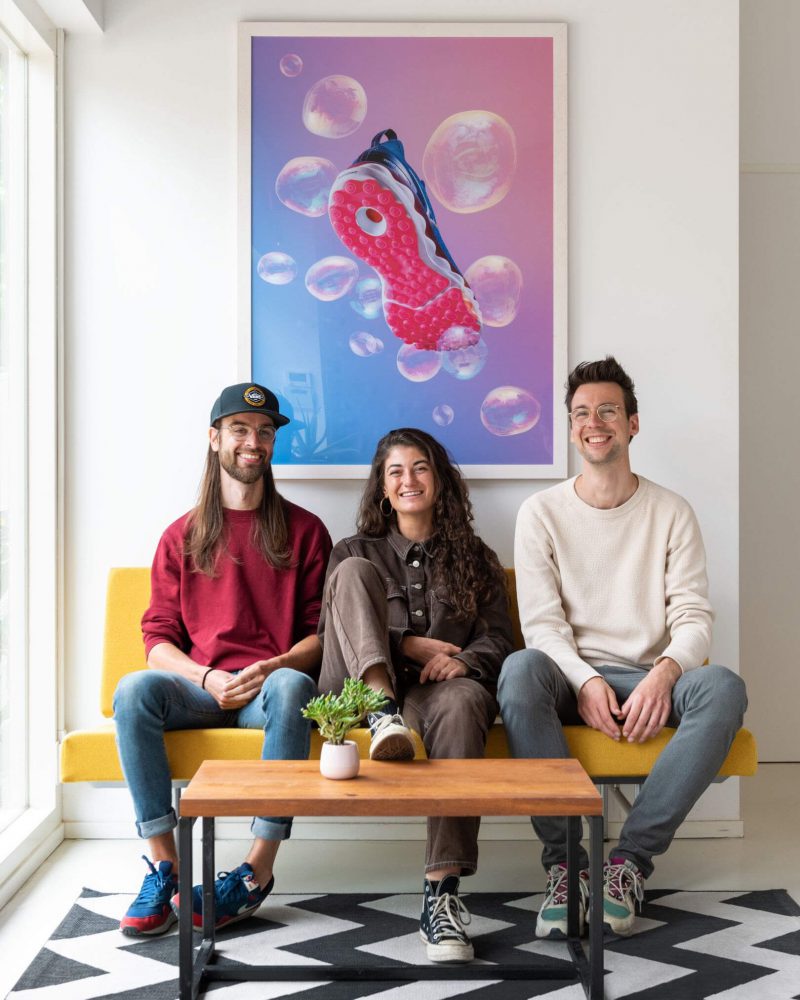
Studio Mals, located in The Netherlands, produces photographs, animations, and short films for big brands such as IKEA, Orangina, and WWF, to name but a few. Co-founder, Martin van der Molen, had this to say about getting his name out there and attracting the attention of big-name clients.

“In my opinion, [doing great work] is still the best way. It may sound cliché, but we’ve found it to be true time and again. Doing your projects with love and dedication shows in the work. And great work gets noticed. Next to doing great work, we make sure to have an updated portfolio and a matching tone of voice in our communication. We believe it’s those details that separate you from others. It’s the complete package that gets your name out there.”

Read More About Studio Mals
(and check out some of their super fun work!)
Understanding Motion Graphics in Web Design

Your Week in Review

Welcome to the Haus Report, your weekly dose of design, business, and leadership news, from BC Design Haus

In this issue, we’ll chat about how to leverage motion graphics for web design, the impact of the creator economy, why marketing goals should be tied to strategic planning, and ways to make the hybrid work model work for all your employees. Let’s dig into it! 

Understanding Motion Graphics in Web Design

Let’s start by defining exactly what motion graphics are.

  • Want your sparkling new logo to spin into position at the beginning of a video? Motion graphics.
     
  • Want the bars on your fancy Excel spreadsheet to slide in one by one? Motion graphics.
     
  • Remember the yellow scrolling text at the beginning of Star Wars? Yep, motion graphics.

Simply put, it’s the movement of graphic design through time and space. Pretty cool, right?

What’s The Purpose of Adding Motion Graphics to a Website?

It helps brands stand out & improves conversion. 
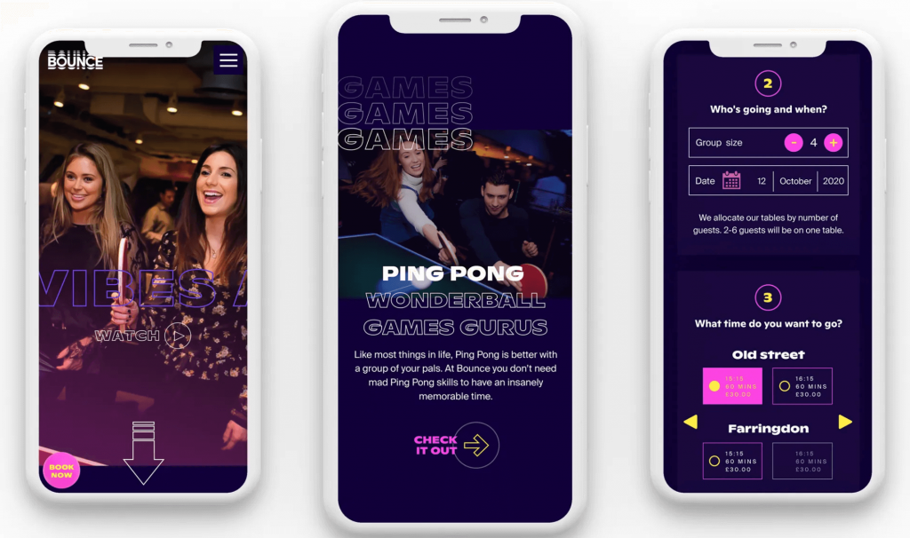
By adding beautiful animation to your website, it’s a sure-fire way to stand out from the competition leaving the user with a memorable experience. It also keeps the user engaged for longer increasing the likelihood of conversion.

It makes websites more intuitive & easy to navigate. 
One of the biggest advantages of using motion graphics is that it attracts the user’s attention. When used appropriately, users are able to build a mental model of how the system works and how they interact with it.

It adds an element of fun & makes the UI more pleasing to look at.
Motion graphics are really good at conveying a brand’s personality, which is important for building positive user experiences, brand likability, and loyalty.

Read More