Package Design + Brand Identity
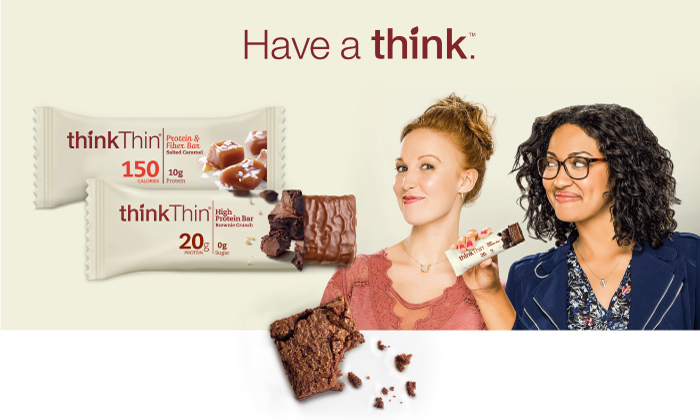
thinkThin
Producers of delicious protein products, thinkThin continues to innovate a very competitive category. We were brought on to achieve a strong health and wellness positioning with emphasis on appetite-appeal. With solid brand equity, we maintained thinkThin’s design language while introducing elements to give consumers pause.
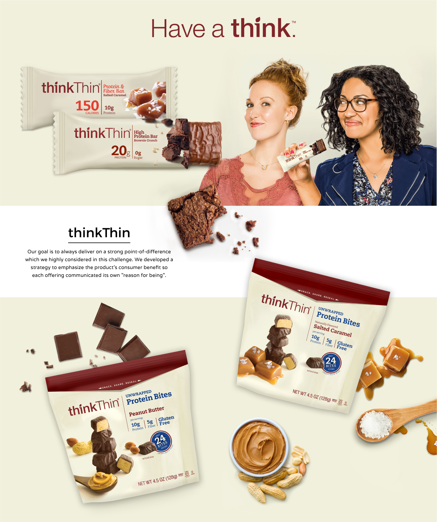
Our goal is to always deliver on a strong point-of-difference which we highly considered in this challenge. We developed a strategy to emphasize the product’s consumer benefit so each offering communicated its own “reason for being”.
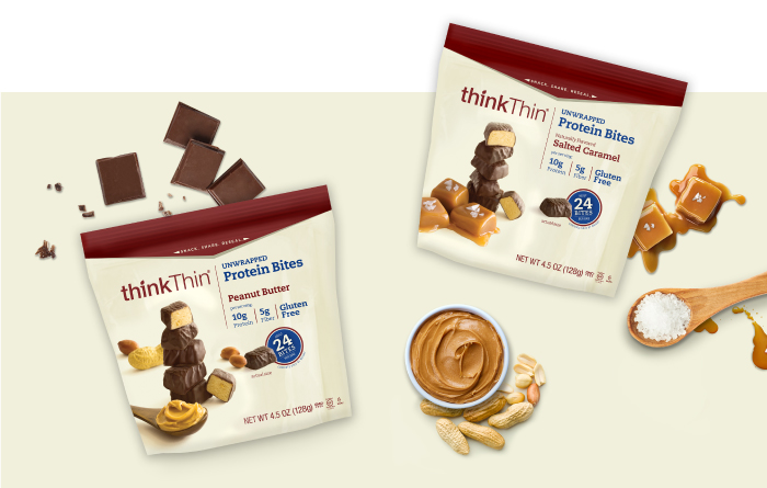
Our brand approach is filtered through its distinct criteria to ensure that it builds equity and awareness in the marketplace.
Bernadette Capulong (2014)
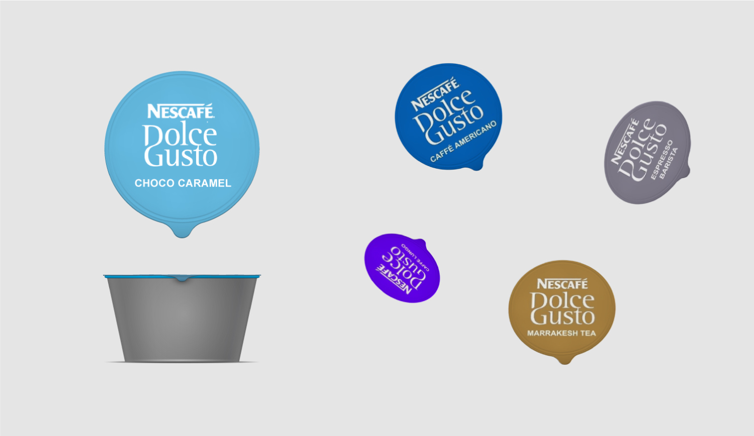
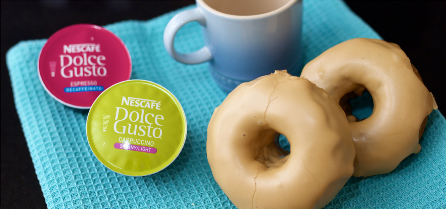
Dolce Gusto
Dolce Gusto is a brand from Europe with strong consumer appeal. We helped develop an identity that was relevant to US consumers while entering the single-serve coffee category.
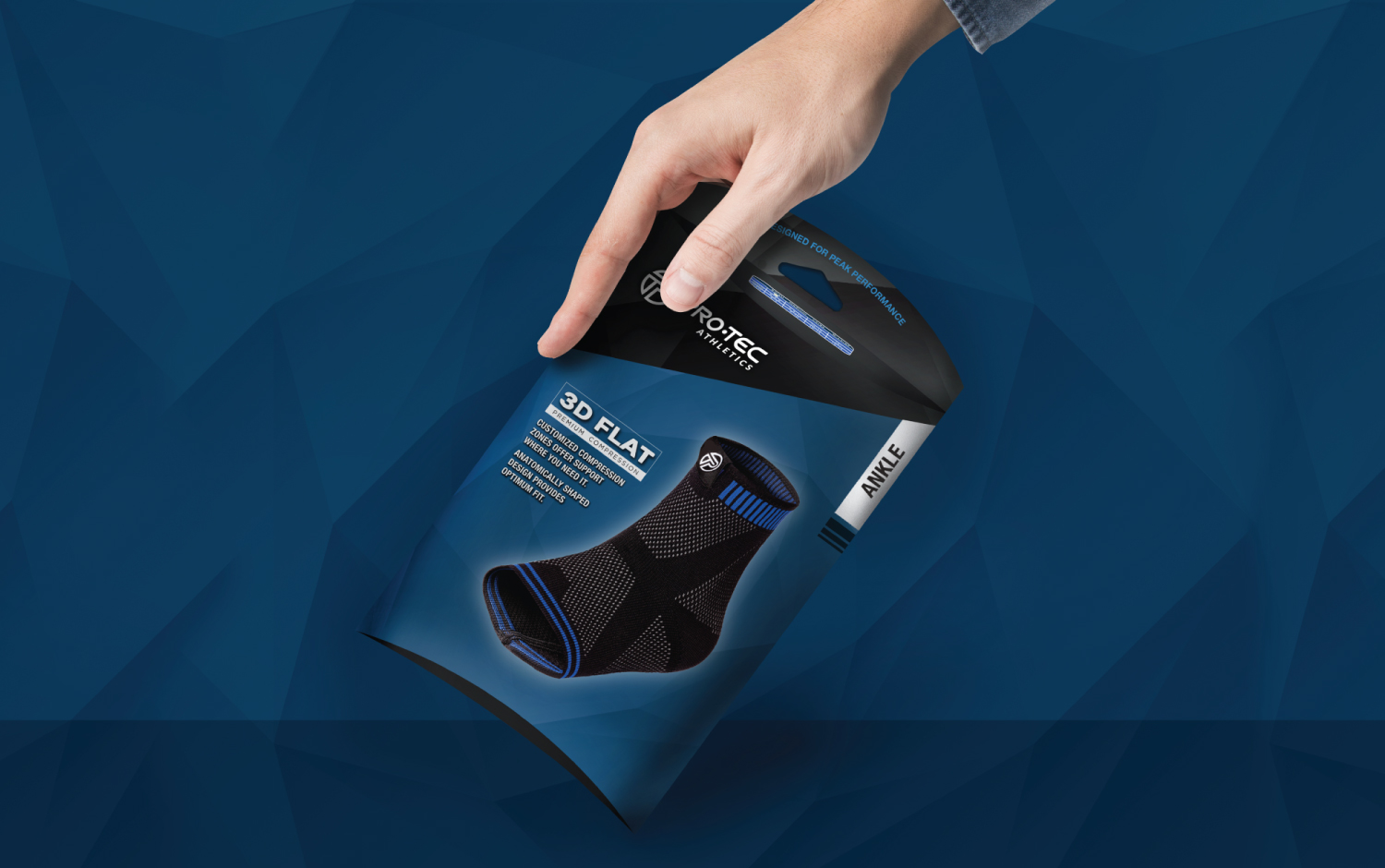
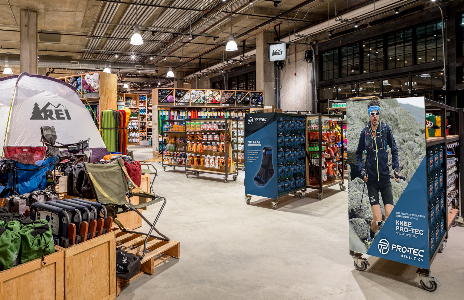
Protec Athletics
Our approach for the redesign of Protec Athletics came from a perspective of needing to remedy the fragemented design of the previous packaging. We focused on upgrading the visual positioning to match the progressive market with a more modern, contemporary design, and package structure.
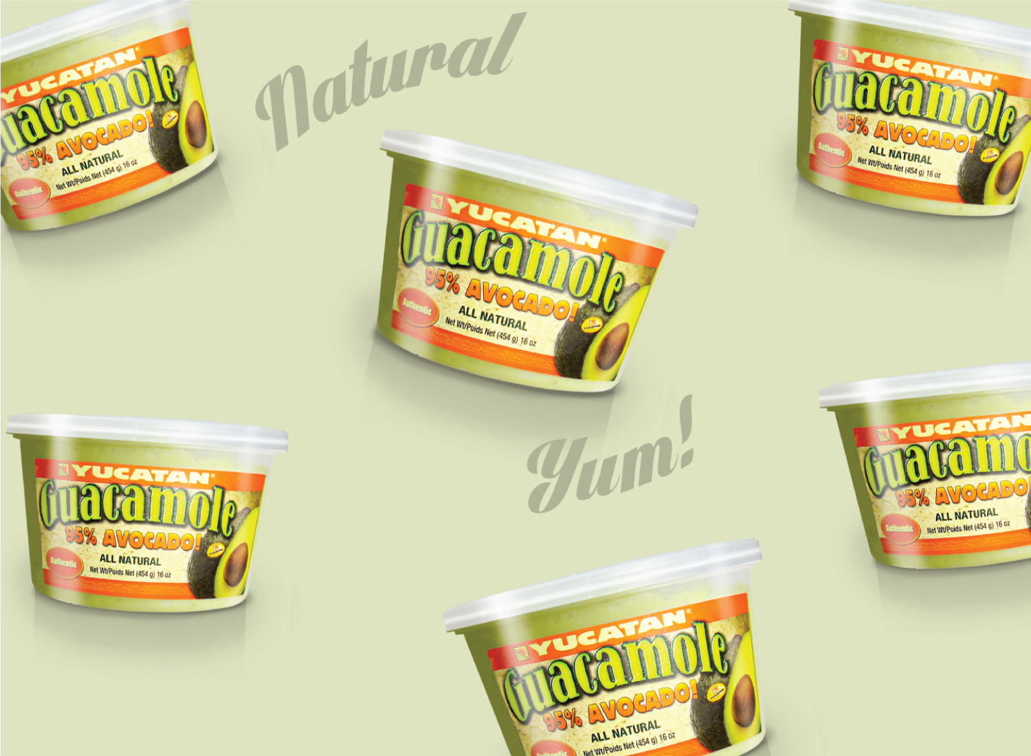
Yucatan Guacamole
As a player in organic, hand-scooped guacamole with a homemade quality, we maintained Yucatan Guacamole’s brand and stretched it to include new product offerings.
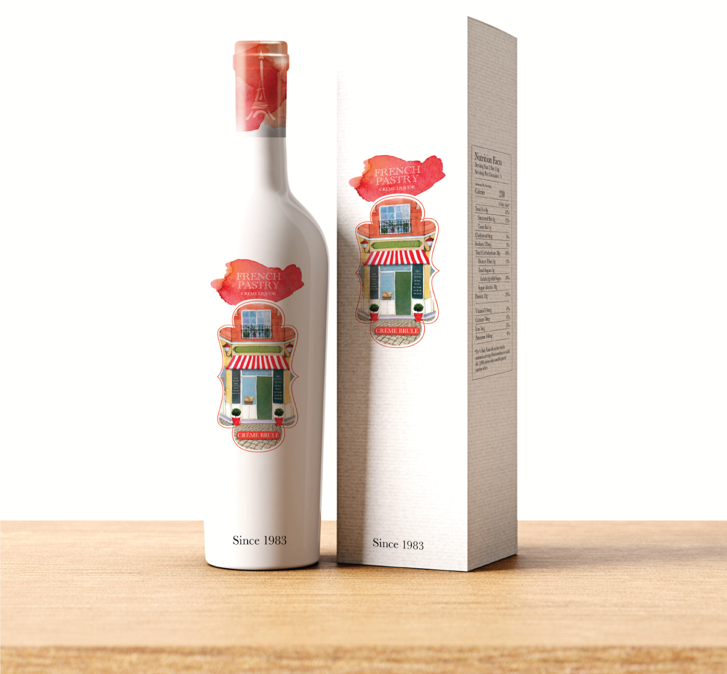
French Pastry
We developed a brand identity for French Pastry, a wine spirits brand targeting millennial women. The client imagined a Parisian cafe indicative of a typical social center in Paris. Our end result is youthful in its brand essence while taking on a French-inspired theme, and was one of multiple design explorations that rose to the top.

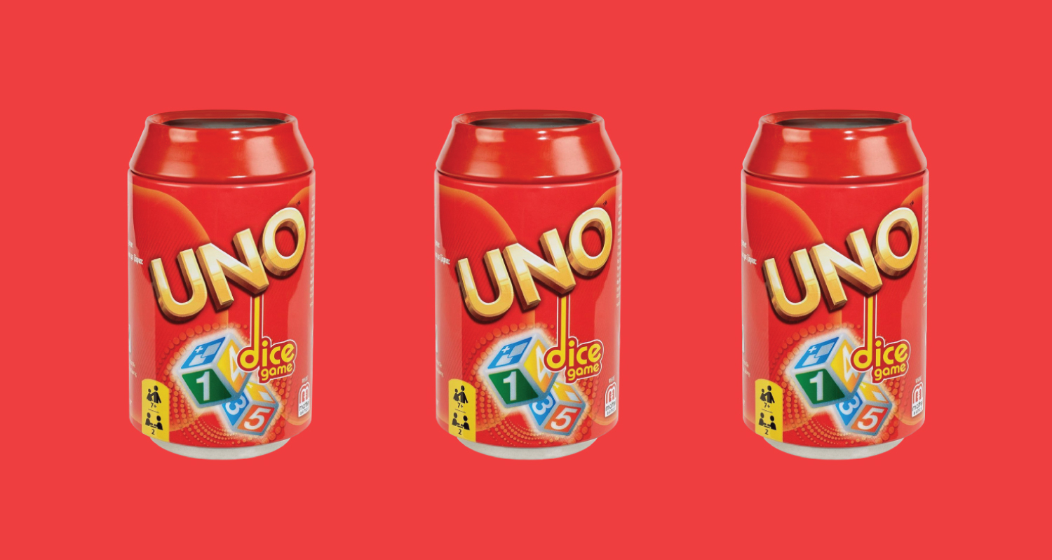
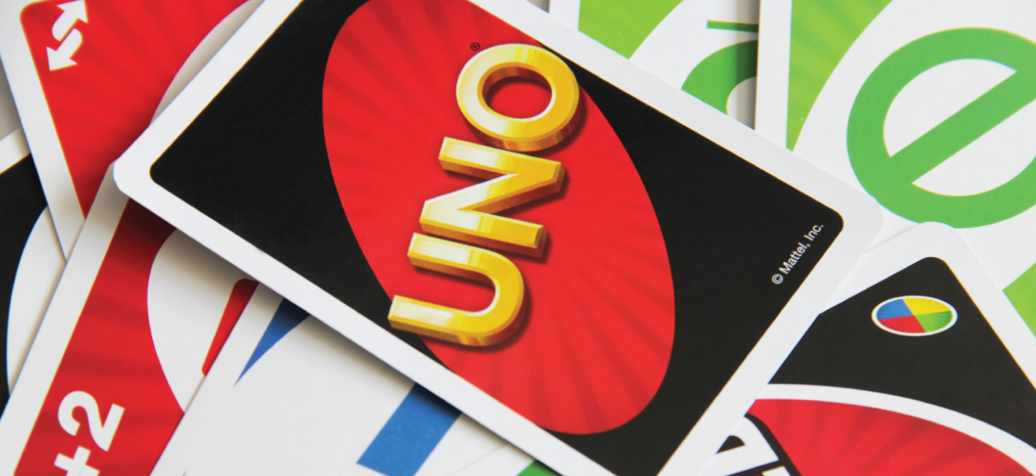
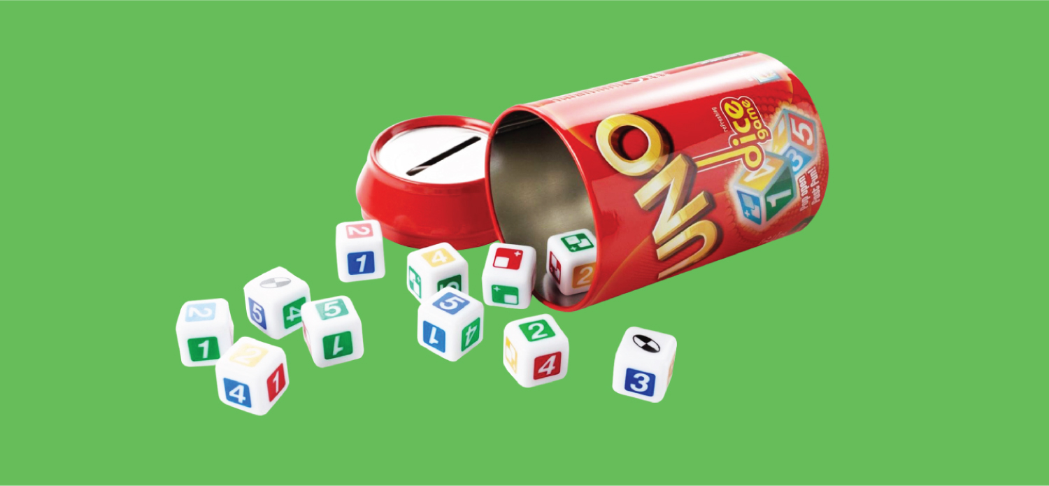
Uno Dice
A recognizable global brand, UNO decided to venture into a new gameplay space outside of cards. To disrupt the category, we developed the packaging through this clever, innovative, yet unexpected aluminum can package.
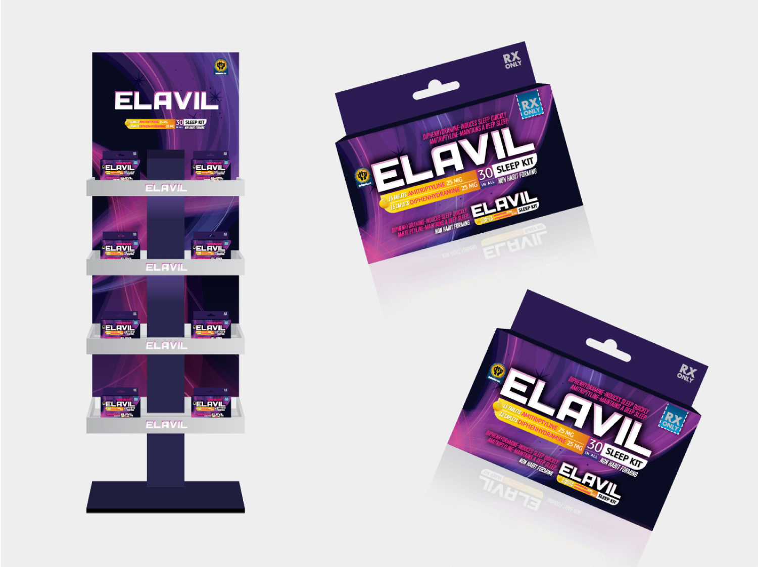
Elavil
Elavil is an over-the-counter sleep aid, that we redesigned to better communicate its product benefits and emphasize night-time usage. We also developed a brand identity that utilized a unique color palette that appealed to its female target audience.

Logo Design
The brand identity should always include an identifiable mark with perceived emotional connections to its audience.