California Jerky Factory
Case Study
Branding & Packaging
California Beef Jerky humbly began as a local brand, with little or no awareness outside of its core consumer. With a bold delicious taste and dramatic redesign effort, it entered into the market with a splash.
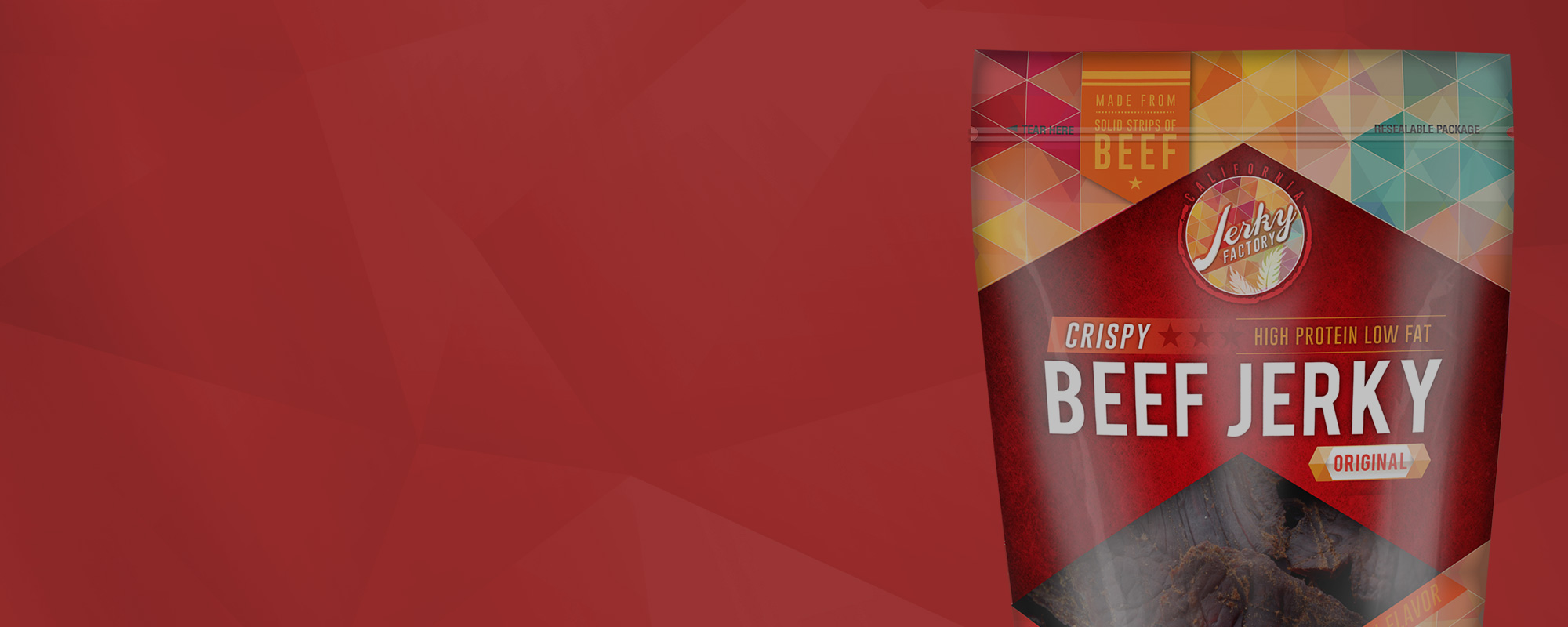
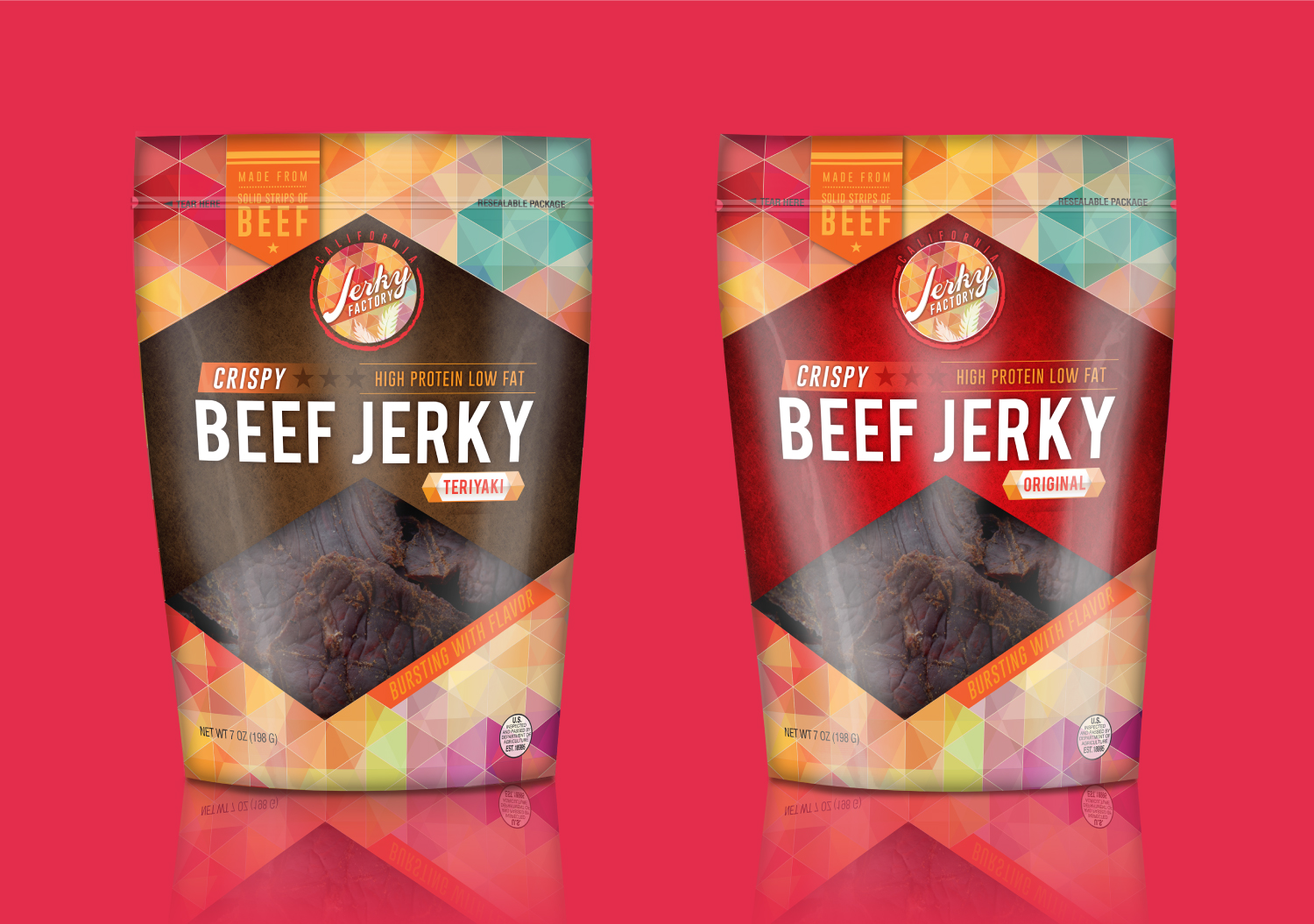
The client had a desire to take the brand to the next level by requesting a more retail-friendly package design with an ownable brand identity. Originally, the packaging was a simple pressure-sensitive label on a clear pouch. In this current look, retailers were not eager to take on the product within the space of new players like Krave & Perky Jerky. The market continued to explode with new and more modern brands, which meant California Beef Jerky had to compete at a very high level.

Branding & Packaging
We immersed ourselves in the category and understood the competitive landscape. We pulled trends and assembled mood boards to create a visual positioning that was unique to California Beef Jerky. This brand needed to stand for taste and unique exotic flavors with a contemporary twist. With new beef jerky brands entering the market everyday, CBJ had to be different, with package design leading that effort. Unique from its competitors, California Beef Jerky had a modern, contemporary positioning that appealed to both men and women (at this time, the category leaned towards the male over female audience). The new package design and logo identity was disruptive to the category and has helped increase sales by 200%.
“Curiosity about life in all its aspects, I think, is still the secret of great creative people.”
Leo Burnett