Mr. Coney’s Barbershop
Case Study
Branding
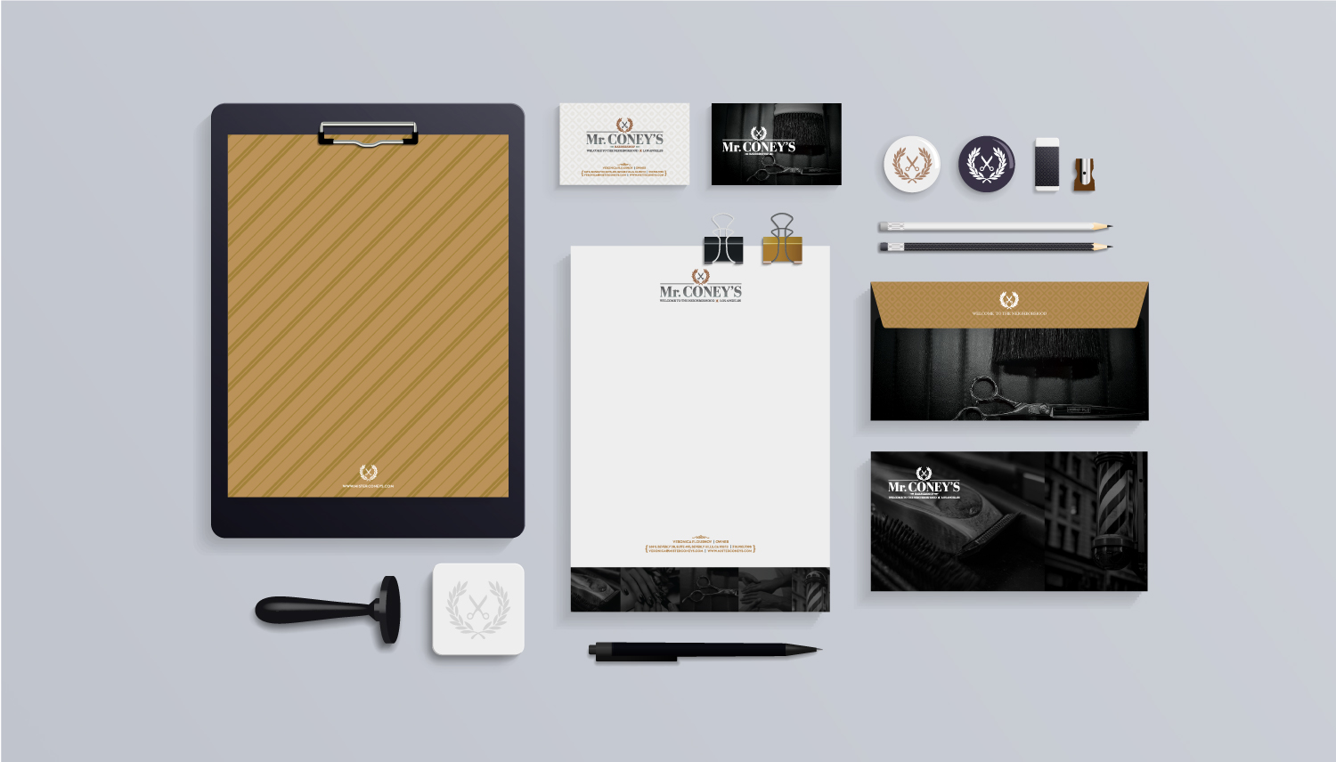
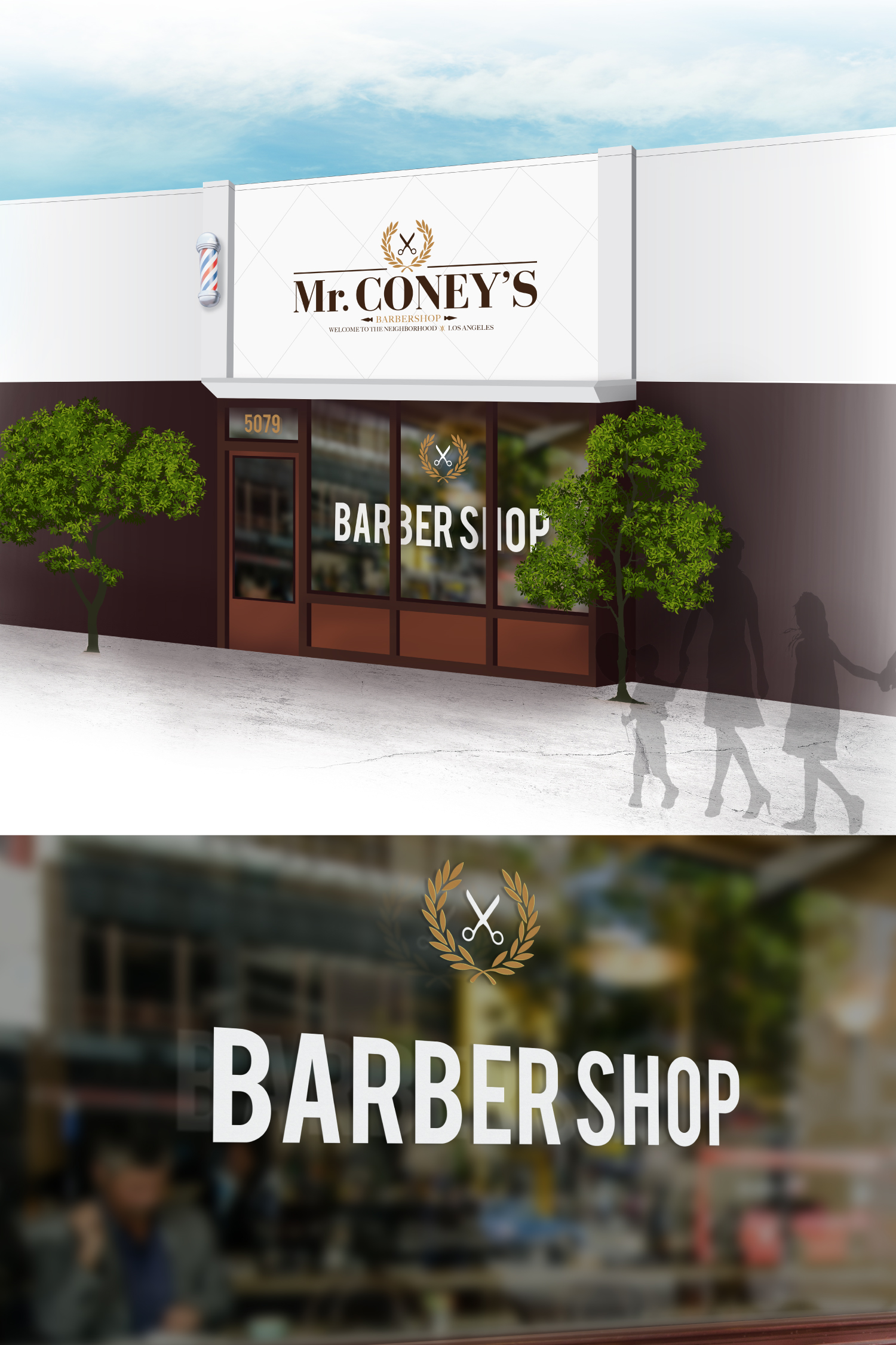
Mr. Coney’s brand identity is a reflection of a traditional experience coupled with a modern classic style. Achieving a distinguished and meaningful brand mark was an essential part of the marketing strategy.
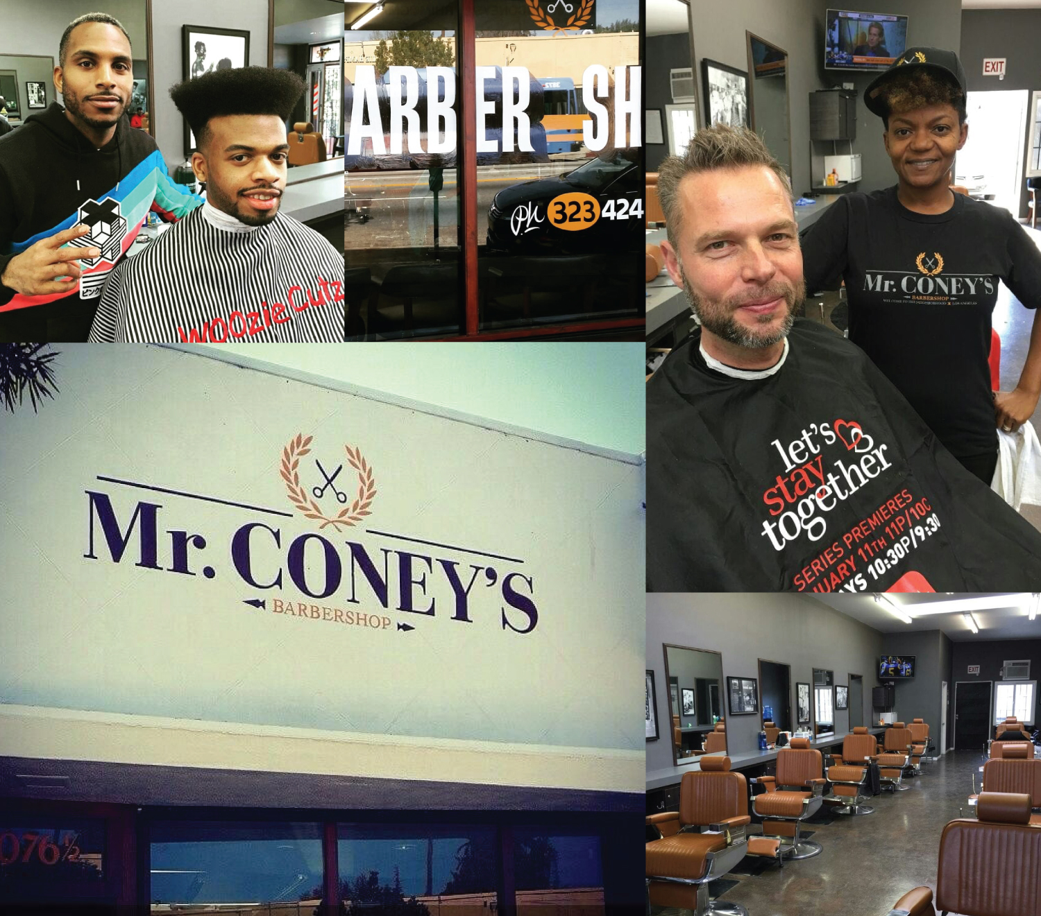
The Mr. Coney’s team had a clear vision from the beginning. They believed their brand should be perceived as approachable, conveying a social center and local community watering hole. From the time the customer enters the store to when they recieve their service, they should feel satisfied and taken care of. This is a time-honored ritual that reflects back to generations when dads and grandpas took their boys to the barbershop.


Logo Development
The brand identity mark plays a significant part of creating a lasting impression. It is a perceived image that should create an emotional connection to its customers. Deciding from the color palette to the iconography was a daunting tasks. Yet, we developed a series of simple and stylized icons that could easily translate from online to print. The photography choice of choosing a dark monochromatic style, created mystique with vintage overtones. We developed over 20 designs that ranged from classic to clean & modern.

“Design is so simple. That’s why it’s so complicated.”
Paul Rand

A Meaningful Brand Image
The Mr. Coney’s brand story caught the eyes of City National Bank, in a national TV commercial spot featuring Dustin Coney, owner of the Mr. Coney’s establishment. Mr. Coney’s brand identity was featured throughout the City National Bank’s 30 sec. TV spot, along with billboard ads in the LA and NY areas. We are very proud to have made an impact in the development of the Mr. Coney’s brand.


